
An investigation of everyday designs around Williams College campus, analyzing their effectiveness and user experience impact.
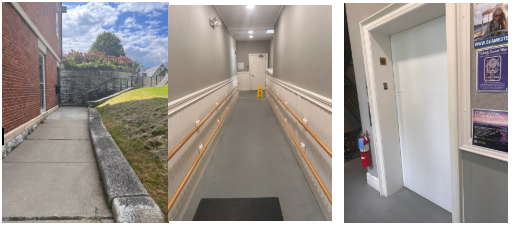
Several upperclassmen at Williams have no idea elevators exist in certain buildings. Griffin's & Shapiro's elevators specifically are located in very strange spots. The design for these elevators does not seem to have been well thought out.
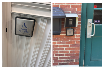
The handicap push plates are well-positioned and serve multiple users beyond their intended audience. They're easily accessible and prove particularly useful when hands are full.
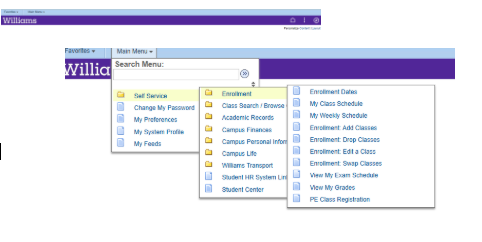
The current SARA website design suffers from poor space utilization and cluttered navigation. As a crucial platform for students and faculty, it requires significant user experience improvements.
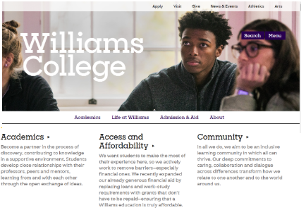
Even though the main Williams website could be improved. I would consider its current state to be a good design. It is simple and contains most of the important information one may be asking about the school. I am not a big fan of the white background, but I think it still works in the overall color palette used for the interface.